Graphic Design
Packaging Design:
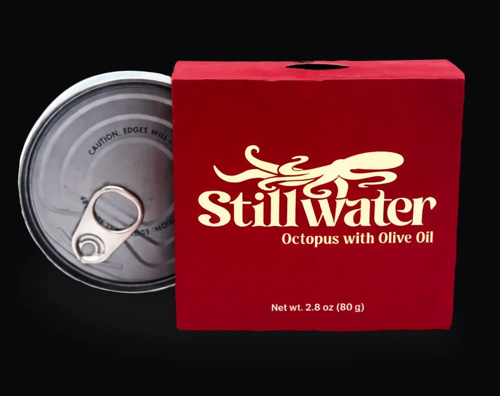
Stillwater is a seafood packaging system designed around simplicity, consistency, and product differentiation. The identity integrates each species directly into the logotype, creating a clear connection between the brand and the product while maintaining a minimal visual system.
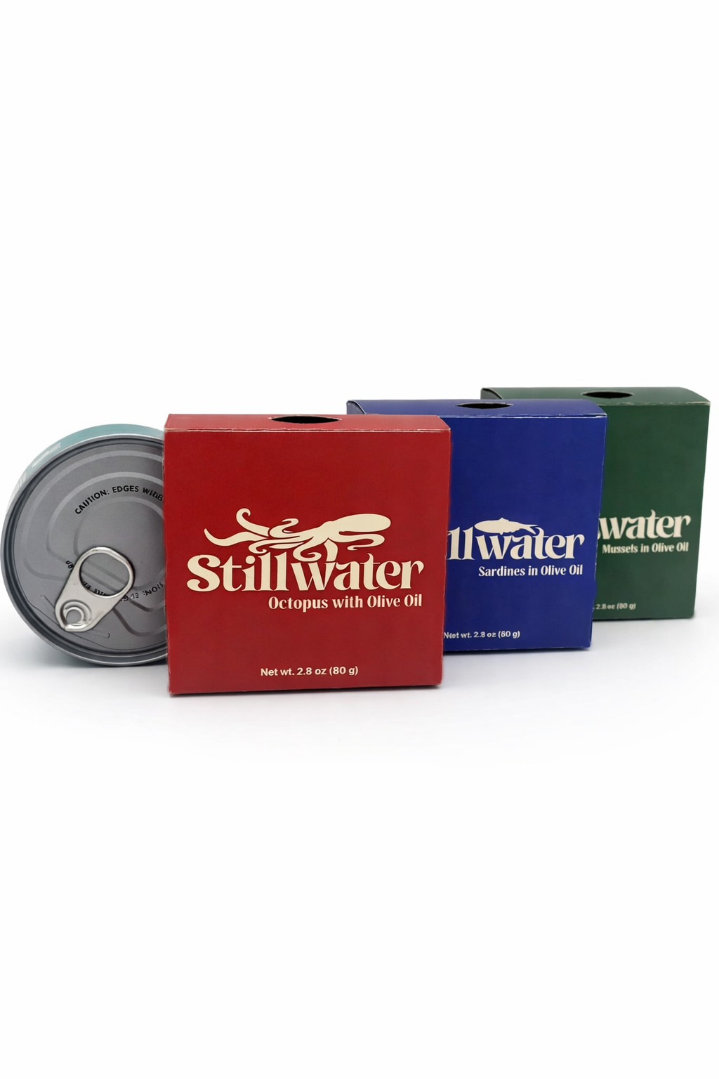
A consistent layout is carried across each package, while saturated color fields distinguish the different varieties. Regulatory and product information is organized to keep the front of the packaging clean and focused, balancing branding, usability, and hierarchy.
Stillwater
Color Palatte
Core colors used
throughout this project
Typography
The typefaces used
throughout this project
Primary Typefaces
Transcity
Regular
Logo
Mileast
Regular
Logo
Final Packaging
01
Final Packaging
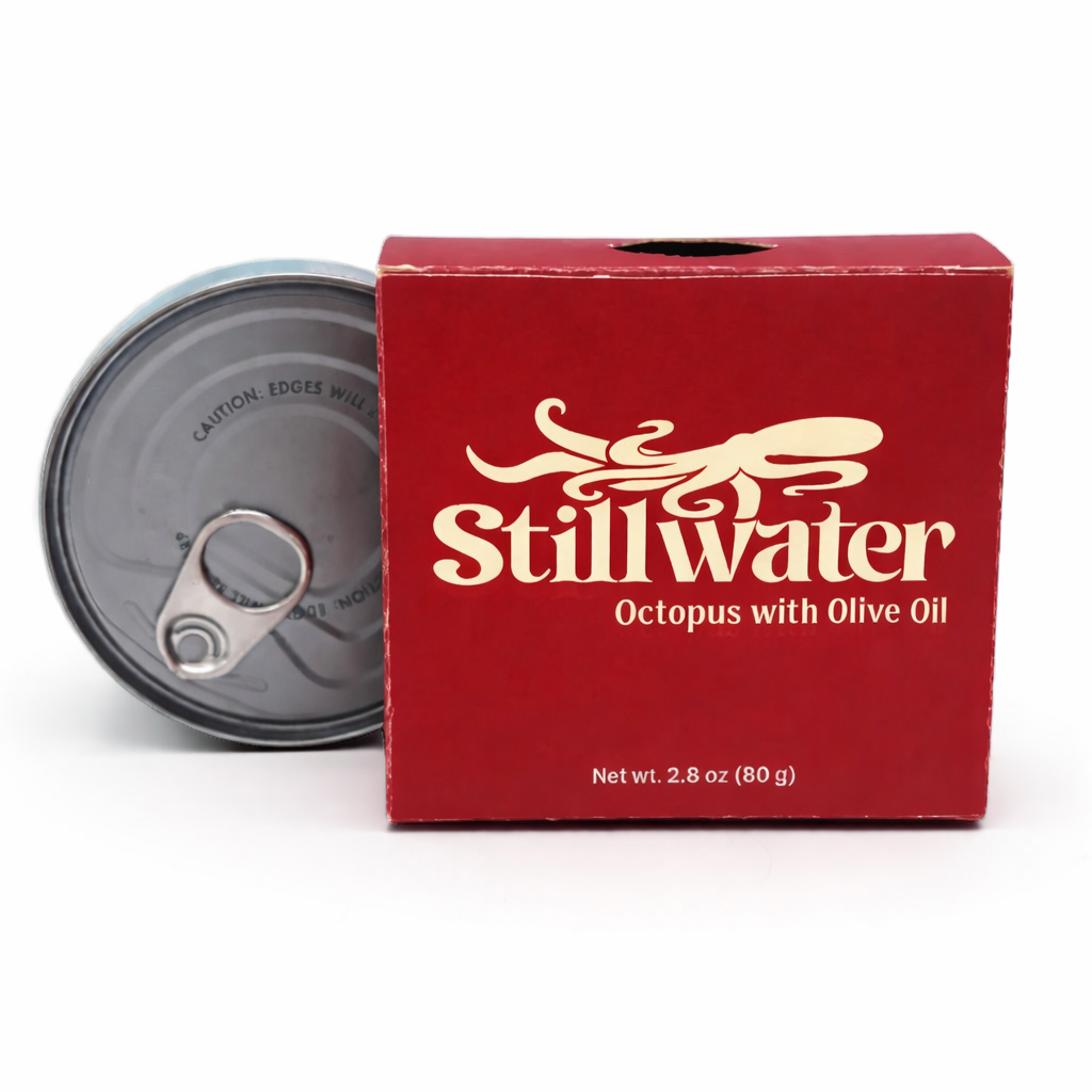
The completed Stillwater package, showing how the identity, typography, and color system translate from the digital design to a physical product.
02
Product Line
The three Stillwater varieties displayed together, highlighting the consistent visual system and color differentiation across the product line.


