TYPOGRAPHIC EXPERIMENTATION
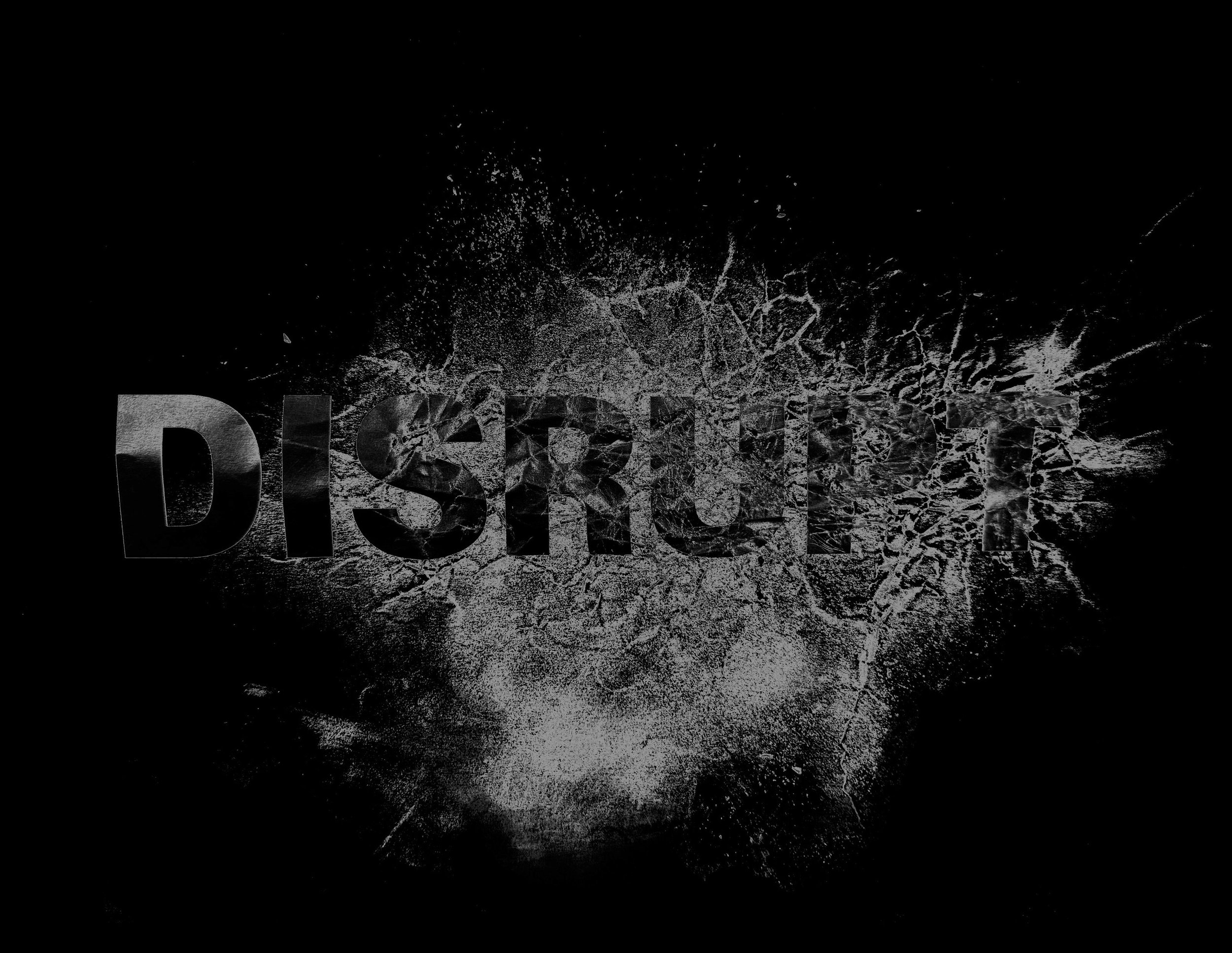
For the Type Exercise, we were given a piece of paper with the word DISRUPT on it, and our objective was to get our hands dirty and to come up with a design to how it’s best described. So for my design, I was a bit hesitant to go ahead and start ripping the paper to shreds so I decided to pinch and crumble parts of the word that was on the paper and with an exacto-knife made small cuts and scrapes within the letters of the word. Once I came up with the main design I wanted it to really pop so with the exacto-knife I scraped graphite onto the paper and smudged it to really make those lines more vivid. After I had my design we then were able to throw it into Photoshop and edit the design. So I put the image into grayscale, edited the lighting, and inverted it so the image would show more black than white.
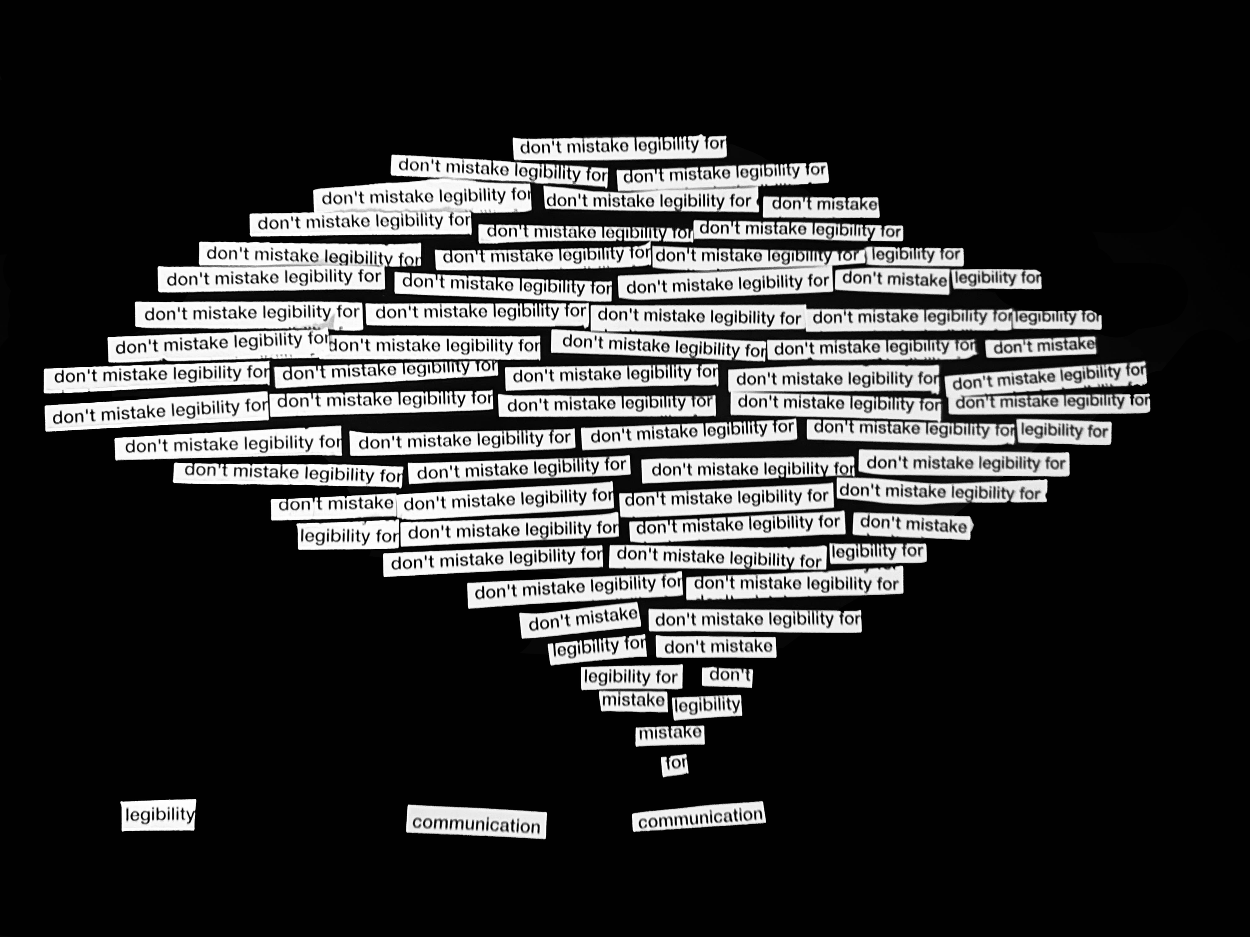
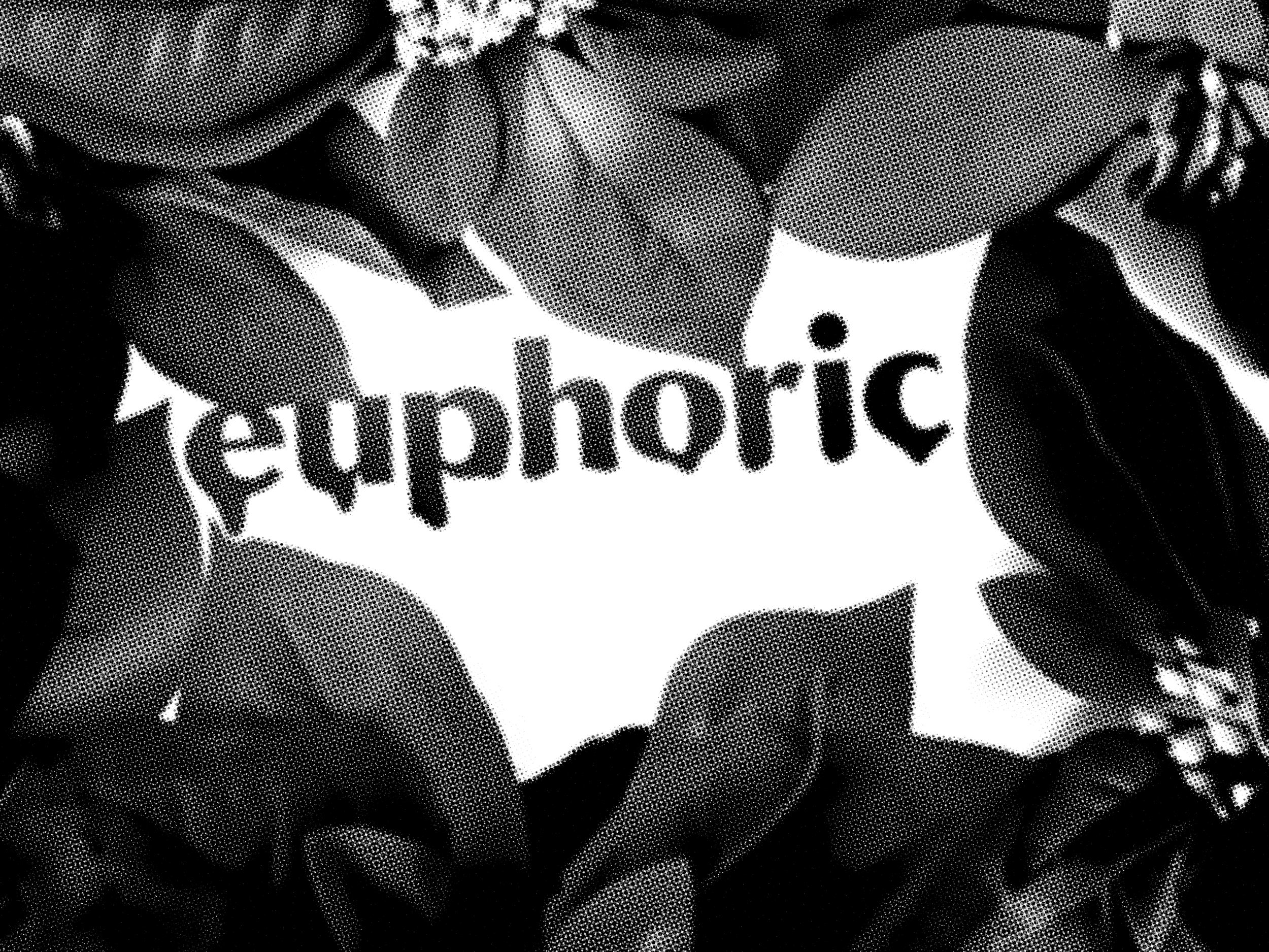
We also did a second type experiment where we were given 2 sheets of paper with one saying the phrase, “don’t mistake legibility for communication,” which was in a reading that we were given on Dave Carson. He had this primary idea that good design is more than simply making things seem stunning or simple to read; it is also about ensuring that the message resonates effectively with its intended audience. For my first design, I made a speech bubble with the words, “don’t mistake legibility for,” then at the bottom are the words “communication,” personifying them so it’s like they’re talking to one another. For the second design, I kinda had a hard time figuring out what to do but I eventually came up with the idea that I should use flowers to resonate with the word euphoric.