Graphic Design
Cinder House is a wood-fired burger concept built around creating a cohesive takeout experience. The project combines brand identity and functional packaging into a unified system designed for a burger, fries, drink, and sauces.
Inspired by the visual language of fire and wood-fired cooking, the identity uses warm colors, bold typography, and a custom flame-and-burger mark across each piece of the packaging.
Cinder House
Packaging Design:
Color Palatte
Core colors used
throughout this project
Typography
The typefaces used
throughout this project
Canela
Primary Typeface
Regular
Logo
Applications
01
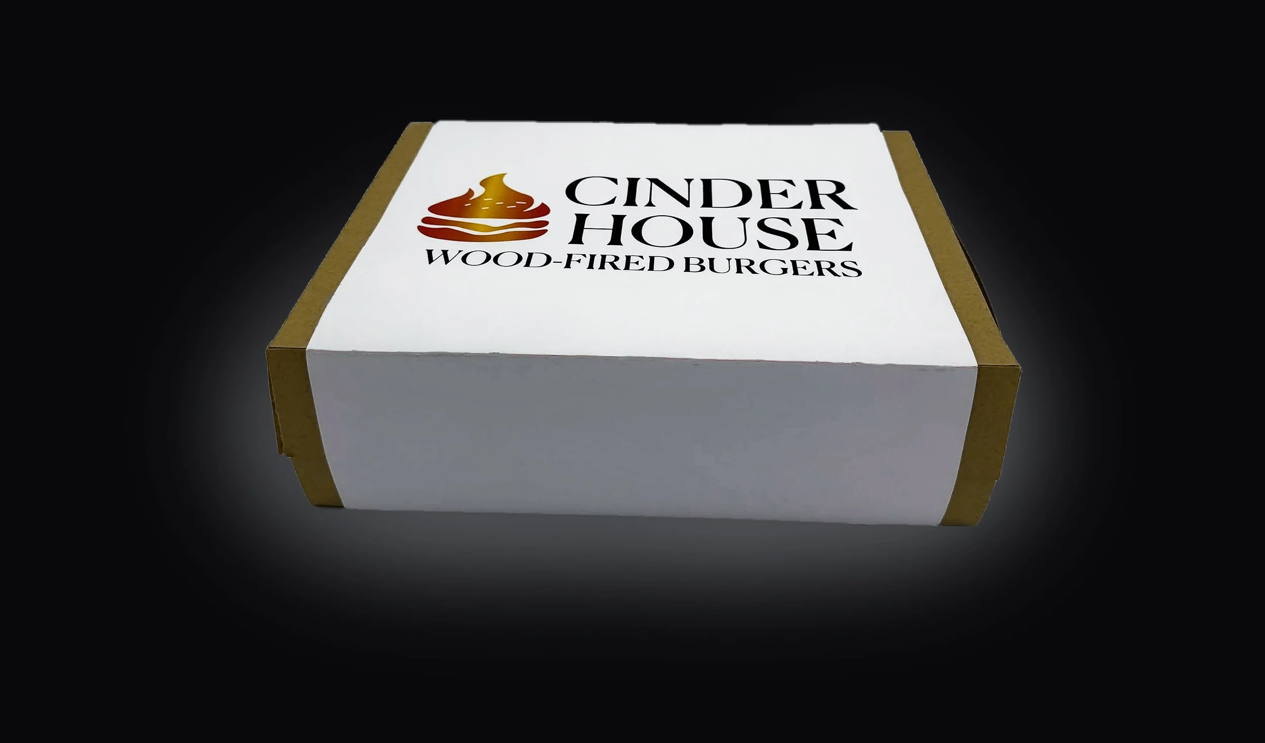
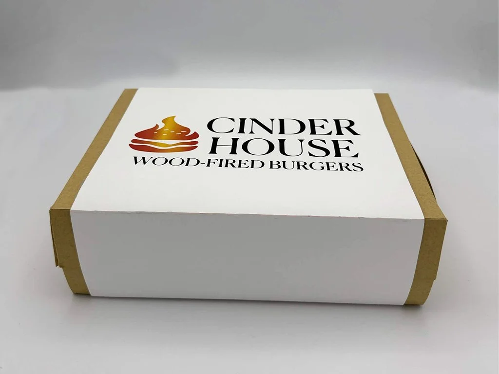
Physical Package
The final package combines a
kraft takeout structure with a
branded outer sleeve.
02
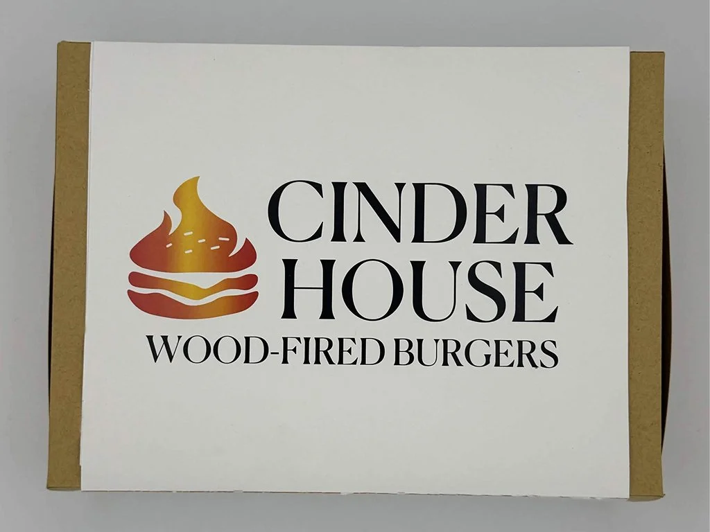
Physical Package
The final package Top view
03
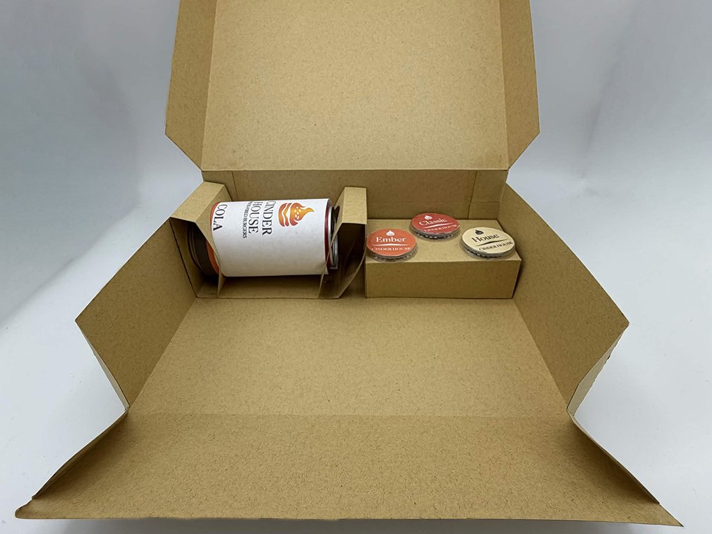
Functional Insert
An integrated insert secures a 12 oz beverage and three individual sauce containers within the package.
04
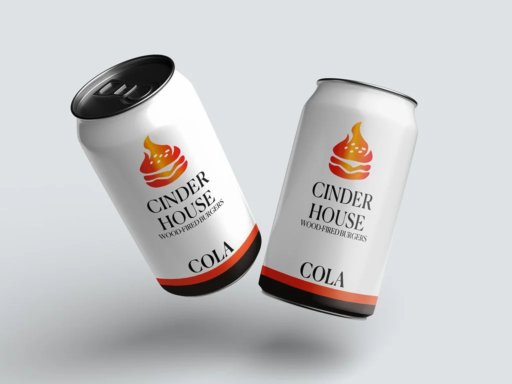
Beverage Packaging
The Cinder House identity extends to the beverage packaging through the same typography, flame mark, and fire-inspired palette.
Structural Design
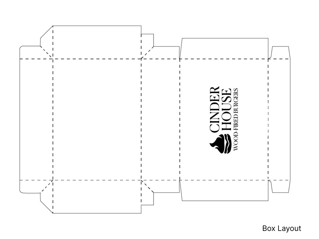
01
Takeout Box
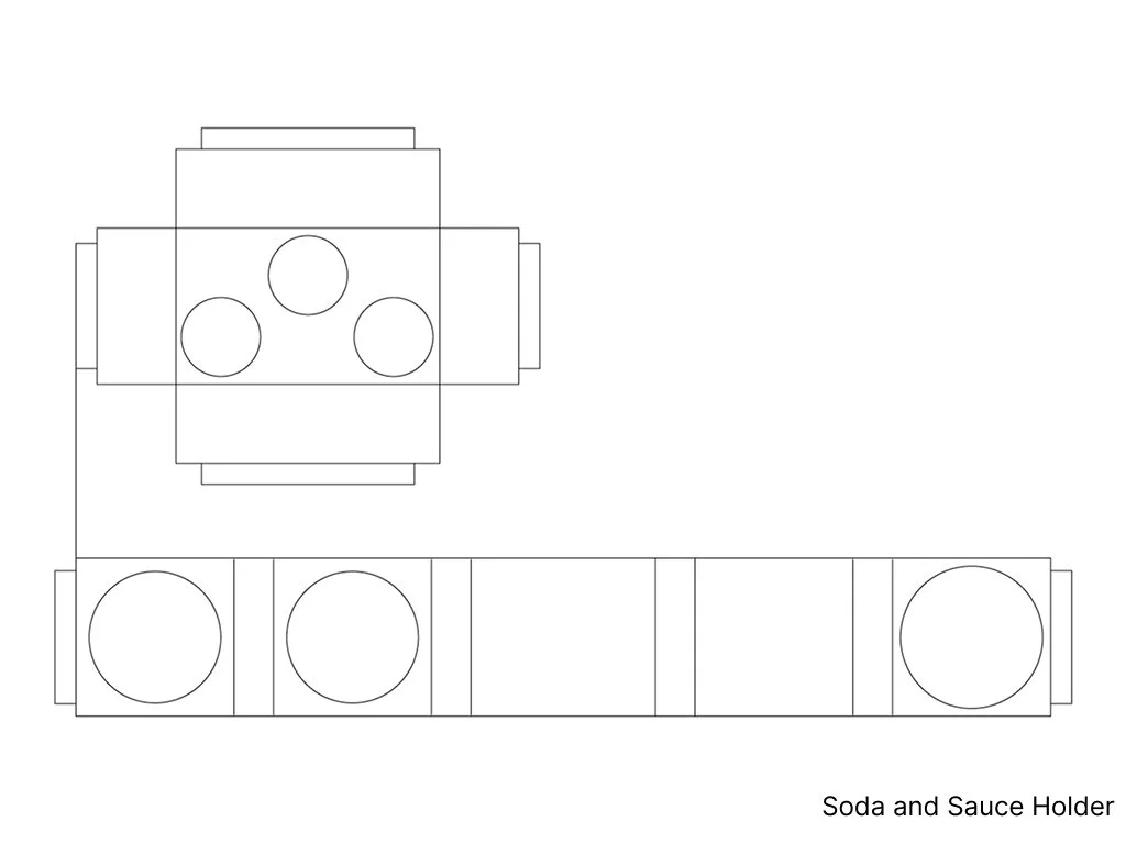
02
Drink + Sauce Insert
The packaging was designed to keep the meal, drink, and sauces organized within a single takeout box. A custom insert secures a 12 oz can and three sauce containers while leaving the main compartment open for the food. The structure was developed through custom dielines and then assembled as a physical prototype to test
the final design